I recently wrote an article on three psychology hacks that influence emotion in design. Now, let’s dissect a website we recently designed and go under the hood to see what went into crafting a tool with a hefty goal of creating a positive emotion about a place that often gets a bad rap due to its isolation and weather conditions: FARGO.
Tip 1: Start by discovering ‘the why’
All of our website projects start and with a user experience philosophy. That’s why we always start with the simple questions: “Who are we building this for? What questions are we trying to answer? What role does this touchpoint play in their journey?” Through questions and research, we determine what will be most helpful to the audience, what is technically feasible and what’s viable for the organization.

For this particular project, we knew that Fargo-Moorhead-West Fargo and surrounding communities are in a workforce deficit. There is a need to get new workforce to move to the region, as well as retain college graduates, current regional workforce and entrepreneurs.
Research found that there are a lot of different websites promoting the region, from business-focused sites to events promotions to publications. However, as a person interested in moving to the region, finding these sites required more effort than necessary.
Through conversations, it was decided that we would build a dedicated repository (website) with its own marketable, search-friendly URL that will help brand the FMWF region and guide the different audiences in finding the information most important in their decision-making journey.
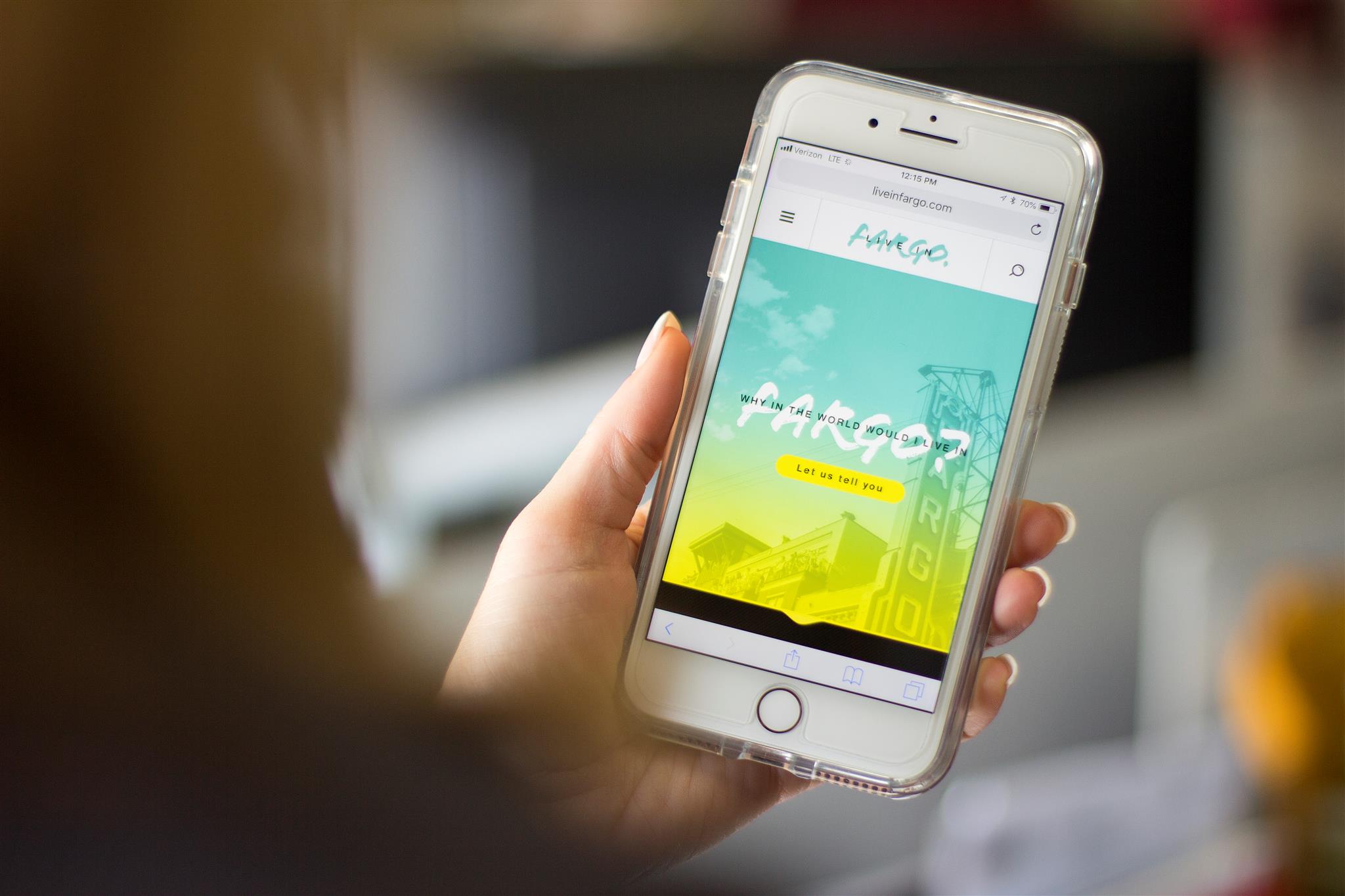
From this, LiveInFargo.com was born. It’s a simple and easy stop for the question, “Why live and work in Fargo (and the surrounding area)?” This repository contains a combination of original content and links to third-party sources for additional information.
The purpose of this site is not to contain every piece of information possible, which would overwhelm people, but instead, guide people in the right direction while giving them a flavor of the friendly community they could be a part of. In short, create a good impression of the Fargo region through a site that delivers a positive user experience.
Tip 2: Build a solid structure
The website structure, or sitemap, is a critical component in ensuring people can easily find what they’re looking for. It’s crafted after all the research is done, input is garnered and user journeys are identified. The sitemap is a hierarchical diagram showing the structure of a website, built with the objective of meeting people’s goals. Basic psychology tells you that a completed goal is followed by a positive emotion.
For the LiveInFargo.com site, our primary audience was people looking to move to the region for work. Interviews and discussions concluded that the most important questions people have before deciding to relocate are: job and career growth opportunities, culture, weather, geographic location, entertainment, opportunities to connect and give back, quality of education, and health care accessibility – all of which equate to a positive quality of life.
With that in mind, we kept the architecture simple and direct, nesting the answers to those questions under clear navigation titles. From there we identified the goals of each page and crafted wireframes. Wireframes can range from concept approval wireframes, build-ready functional specs or content proofs. For this project, we built concept approval and build-ready functional spec wireframes in which we set content priority and site taxonomy and crafted a blueprint for the tech team.
Tip 3: Design and content should emulate the brand

Ahh, design. The part everyone waits for and part that creates the most emotion. Our design team takes the same UX philosophy through the interface design process. Who’s coming here? What’s their mindset? What kind of emotions do we want to craft? We mentioned in the psychology hacks article how different touchpoints, including creative, can influence emotion. Positive or negative. We talked to a few different people who had visited Fargo for the first time and asked them what their first impression was. More often than not, we heard things like “Totally unexpected” or “Really surprising” or “Way hipper/trendier than I thought it would be.”
It’s true. As you walk through the streets of Fargo you’re greeted with modern storefronts, hip restaurants and trendy shops, and large painted murals dot the buildings and alleys. Fargo has a hip, modern sophistication that you wouldn’t expect. And the bonus? People are genuinely nice and willingly give you a smile.
Because trust and positive emotions are built through consistent experiences, we knew that this website design and copy had to carry that feeling into a digital space. We want the people who visit this website for the first time to have a similar reaction. Each element was carefully considered to match the tone Fargo emits. The bright, fresh, non-traditional, contrasting colors are your first signal that Fargo might not be what you expected. The big, bold design elements tell you that we’re not messing around. Fargo means business. The large, vibrant photos were chosen because, sometimes, you just have to see it to believe it. The handcrafted headline font gives a nod to the fact that this region is made of friendly, warm and community-driven people. And the copy? It’s real, to the point and transparent, proving that we weren’t afraid to face the elephant in the room: the weather.
In the end, the design and copy were fully inspired by the region itself and deliver the same warm, friendly, unexpected experience.
Tip 4: Don’t skimp on development

Developers play the same role as the builders for your home. Development is where the real magic happens. Vision becomes reality, and a site becomes functional. I call our developers “unicorns” for a reason. Not all developers are created equal, and we’ve learned that the hard way. Choose wisely. We’re lucky enough at Flint to have actual magical unicorns as developers who are able to think about every dimension of the build before they start, mitigating issues later. Once we had our magic unicorn in place, we started by choosing the correct content management system (CMS) to become the foundation of the site. This is critical and one of the most important decisions we make.
From the start, we have strict development guidelines that require clean, smart code that takes into consideration everything you can’t see, like WCAG accessibility, SEO and markup, all while maintaining the visual integrity of the UI design, which is no small feat given how much our designers like to push the creative bar, especially on the LiveInFargo.com website. When it comes to emotion, the developer plays the critical role of ensuring the site functions like you expect, links work and pages load quickly.
Tip 5: Perfectly balance form and function
You often hear the “form before function” or “function before form” battle. However, we believe that if your goal is to create a positive emotion in whatever you’re doing – websites, mobile apps, landing pages, etc. – you need to have both form and function in complete alignment to build trust and create happy users. That’s why it’s important to put the work in upfront to ensure you truly understand the audience, the structure is strategically sound, the design and copy are on target with your brand, and whatever you build out functions as expected, or better. When all items blend harmoniously, that’s when you create a website that delivers a positive user experience.
If you need help crafting the perfect message or user experience for your website, reach out to us. We’d be happy to help.
Jen Strickler
With her passion of understanding and crafting experiences, Jen works with clients to integrate digital communication strategies into their overall marketing matrix. From defining the usability standards of simple websites to full digital communication plans, Jen defines appropriate solutions to help clients meet their business objectives. With over 20 years of experience, Jen believes that effective interactive work must be relevant and intuitive. She works closely with the entire digital team in architecting and validating cohesive user-focused solutions that work seamlessly into the user’s journey with a brand. She also really enjoys the salted caramel cupcakes from Hy-Vee.
