

If you have a website, your website probably has a form.
Your form can be a contact form, an order form, a form to ask questions or a form to sign up for a newsletter, among many other types of forms.
Most people – both business owners and marketers – don’t give a lot of thought to their forms. So long as the website visitor can fill it out and someone on the other end receives it and responds in a timely manner, there’s no further action required.
Here’s the problem with that: You’re forgetful.
We are all forgetful
Our brains have only so much processing power, and remembering and organizing every person who’s ever filled out the form(s) on your website – and why they filled them out to begin with – is an impossible task.
The antidote to our forgetfulness is in creating great forms.
Consider this your cheat sheet on how to structure your forms to improve communications with potential customers and save yourself time and energy remembering how each contact came into your system.
What form fields should you include?
Nothing encapsulates the dilemma over what fields to include on a form quite like this very, very funny meme I made.
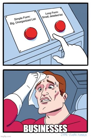
Some businesses simply ask for your email address when filling out a form, while other businesses seem to want a reference letter and a birth certificate before clicking submit.
So, what’s the right strategy?
Well, as with all answers in marketing, the answer is … it depends.
At a bare minimum, my suggestion to any business owner or marketing team is this: Ask for a first name and an email address.
Why? Because I want to be able to address you by your name in emails I send to you, even if they’re newsletters that are going out to hundreds or thousands of contacts. It’s just polite to address people by their name.
Outside of someone’s first name, ask yourself if there’s any information that really matters to your business.
We work with many agricultural clients, and in agriculture, knowing someone’s geography is HUGELY important. Someone looking for herbicide in northern Alberta, Canada, has entirely different needs than someone looking for herbicide in central Florida. That sounds obvious, right?
What are obvious, unique markers that you need to know about your audience? Make sure they’re included in your forms.
Define the form and add context and transparency
Okay, what exactly is each form for?
Again, this might seem obvious, but it helps to be crystal clear with your intentions because if there’s any ambiguity whatsoever, you can guarantee website visitors will become confused.
The ideal form will define itself with a title and context (explain what to do) and will provide transparency around the next steps.
Here’s an example using a simple contact form:
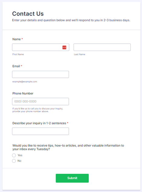
Here’s what this form establishes:
✅ Defines the purpose of the form (contact the company)
✅ Adds context around the forms purpose (to ask a question)
✅ Provides transparency with respect to how much time it may take to receive a response and why they want your phone number
✅ Gives further transparency around opting in to the newsletter that is sent every Tuesday
Every field on this form serves a purpose that will be clear to those who are filling it out.
Tag or segment your audience
Most businesses have multiple forms and landing pages.
Imagine if your business has forms to:
- Contact us
- Submit a return
- Enter giveaways
- Register for events
- Sign up for a newsletter
That’s five possible forms, not including variations of each form (e.g., multiple trade shows requiring multiple tags or segments).
Now imagine if you never bothered to tag contacts as they filled out each form. Would you have any idea what form entered them into your system? No. You wouldn’t.
And what happens if the same contact fills out multiple forms?
That’s even more confusing.
Every form should have a tag associated with it, and if a form has important selections that a person can make (e.g., Are you interested in men’s, women’s or children’s fashion?), those choices should be broken out into their own segments or groups as well.
Compliance
There’s often a wide gap between what you NEED to do and what you SHOULD do. This applies to life as much as it does marketing.
So, while you don’t technically need to have a contact explicitly state whether they want to join your newsletter to add them to your newsletter list, you should.
You really, really should.
No one likes unsolicited emails, and bad practices when it comes to growing your list will only work against you in the long run as your rate of successful deliveries declines and unsubscribes and spam complaints rise.
Long story short: Add the opt-in checkbox to the bottom of all appropriate forms.
Mobile Optimization
Did you know that mobile accounts make up 57.8% of all internet traffic?
Despite this, most web-based design work is created for a desktop-first audience.
You can see the problem here.
Any good form should be optimized for mobile and tablet, which means that you should, when possible:
- Minimize the number of fields
- Automate inputs
- Use a single-column layout
- Consider the “touch” experience
- Create clear action buttons
- Make sure the form is accessible
- Use input constraints (e.g., you can only select numbers for the phone number field)
Forms that are optimized for mobile tend to benefit desktop and tablet users as well, so it’s a win-win-win to always double-check your mobile UX.
Good forms will save your sanity and create a great experience for customers
It’s best to think of forms as far more than just a way for website visitors to get ahold of you or sign up for your email list.
Instead, start thinking of forms as such:
Forms are a way to organize the details of every web-based inquiry (who, what, where, when and why) so you can follow up with timely, relevant and engaging information in their inbox.
To paint an even clearer picture, here is how to best understand the who, what, where, when and why of form submissions.
- Who – What is the name of the person contacting you?
- What – What form did they complete?
- Where – Where did the form get completed (website, tradeshow, giveaway landing page, etc.)?
- When – Each submission should have a date and time of completion attached to it.
- Why – What was the purpose of them filling out the form?
The data attached to each submission (each contact) should answer those questions clearly for you if you need to dive deeper into a contact’s profile.
On that note, have fun organizing your contacts, and if you have any questions about form creation, ask them below!