This is the first in a series on user experience. Stay tuned for more in the coming weeks.
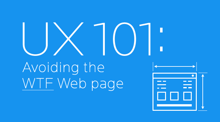
The WTF Web page.
If you do even minor online searching, you know what I’m referring to – that website or landing page that makes your head feel like its going to explode. No call to action – or seven bazillion of them. Hard-to-read fonts. Screaming colors. Flashing starbursts …

OK, I need a massage just thinking about it.
The point is, good user experience (UX) doesn’t just happen. It comes with user research, detailed planning and finding validation along the way.
The UX process
Our good friend Mark Twain said, “I didn’t have time to write a short letter, so I wrote a long one instead.” He, of course, was referring to Web design and user experience.
It takes careful research and planning to pare a website down to its core, removing all unnecessary action and information.
This process starts with a user experience designer (like myself) who creates a series of documents that support what I call the working brainstorm. While completing the documents, solutions begin to appear.
Common UX documents
Here are the main documents Flint Group uses to create optimal user experiences for our clients:
- Personas – Provide descriptions of each main user type to understand their actions, frustrations and goals.

- Usability audit – Basically lets you know if your website is user friendly and provides recommendations to make it better. It may or may not include a competitive analysis.
- Content inventory – Determines necessary information for the website and prioritizes all content. (Click the image below to view a larger version.)

- Site map – The outline or road map of the website forms and navigation is determined. Also known as the information architecture (IA).

- Process diagrams – Shows the process the user takes in any given task. Also known as a user flow, user journey or user scenario.
- Wireframes/prototypes – Acts as a blueprint for design. A wireframe prioritizes visual content and outlines functionality. Prototypes are wireframes that have functioning navigation and buttons used for user testing.

In upcoming posts, we will be focusing on each one of these documents and how they can help businesses improve their user experience. If want to learn more or talk about user experience now, contact us. We’d love to chat.