In a recent article, Flint President Jodi Duncan asked “Who will be king in 2018?” Turns out, she says, it’s data.
Data is great. It helps us see actions people took with our marketing. They filled out a form, they watched a video, they commented or they clicked “Complete purchase.” Using this information as a guide for future direction is critical. In the end, data is just a single pinpoint in a sea of black dots that tells us what someone did. But there’s another part to that data story. It’s the point immediately before they took that trackable action. We call that “The Why.” Why did they do something? What emotion drove them to action?
Emotion in marketing
There are numerous articles and research documents on the illogical functioning of our brains in decision-making. Even in our most rational moments, emotions still govern our behaviors. How do we stimulate specific emotions?
Understanding human psychology, including emotions, is as critical to marketing as measuring results.
Persuasion, attention, memory and comprehension
How do we create an emotion that will lead to an action? Understanding the science of persuasion, attention, memory and comprehension is a good place to start. Here are three psychology hacks to get you started.
1. Aesthetic-Usability Effect: To use interface design as an example, people believe that the more aesthetically pleasing, the easier the tool will be to use. In fact, according to Nielsen Norman Group (NNG), “Users are more tolerant of minor usability issues when they find an interface appealing.” The quality of the photo, the tone and amount of copy, and other design elements all create an emotional response that nudges people forward or stops them in their tracks.
2. Halo Effect: A single trait, often experienced in the first-impression phase, will influence overall perception about that person or product. NNG states, “The halo effect allows us to make snap judgments, because we only have to consider one aspect of a person or design in order to believe we ‘know’ about all other aspects.”
At Flint, we look at this in the form of touchpoints. Are there any first impression touchpoints in your brand that cause a negative emotion? Maybe it’s a frustrating, outdated website or a bad experience with a sales rep. That first touchpoint may create a “halo effect” that will carry through to the overall perception of the brand. We often recommend a user experience or customer experience audit to help uncover potential problems.
3. The Paradox of Choice: In his TED talk on The Paradox of Choice Barry Schwartz discusses how autonomy and freedom of choice is critical to our well-being, but not always good for decision-making. Give someone 100 choices and they’re less apt to make one than if you give them three. Too many choices increase anxiety over potentially making the wrong choice.
This marketing principle is one of my favorites, especially when conversion is a goal. In auditing websites and landing pages, I often come across what I affectionately call “The Squirrel Effect.” To those of you who have seen Disney Pixar’s Up, and are familiar with Dug and his attention deficit squirrel problem, you know what I’m talking about. Like dogs, humans are easily distracted.
I have heard this countless times: “We need to have this link, and this link, and this link, and this link, and this link … just in case the potential customer wants to do XYZ.” However, adding too many choices leaves the person paralyzed by choice, emotionally frustrated and likely to abandon your intended goal. This is especially true on landing pages with a single conversion goal. If you have one goal, give the user only one choice to make.
This is also true in design as a whole. A creative piece tends to be more impactful if there is a single point of focus. People are inherently lazy when it comes to interacting with marketing. It is critical that we make it easy for them to understand exactly what we want them to do without having to work at it.
Emotion is data
Studies have proven that emotional appeals are more effective than feature/function. How this product or service will make me feel or improve my life tends to have a greater effect than explaining how it works.
However, there is a huge caveat to this point. Knowing where the person is in their buying cycle is critical. That’s where the magic of data comes in. If we know that a person is at an early stage of their buying cycle, the emotional appeal is the first hook. However, if we know they’re interested in the product already and need confirmation on features or cost, then delivering that information may be the trigger necessary to nudge that person into taking action.
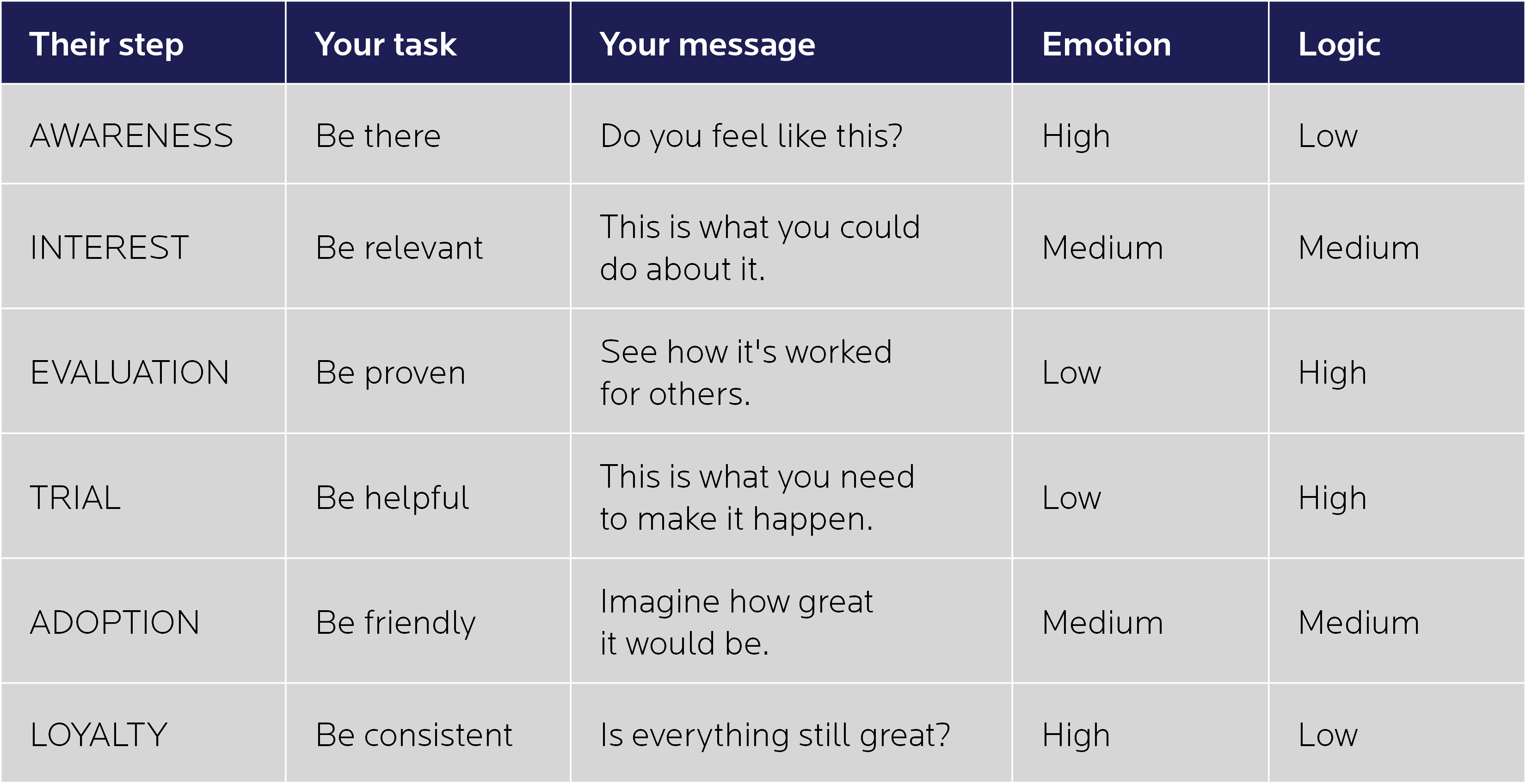
Often, we see companies throwing the same message to everyone without regard to a potential customer’s historical interactions. That alone can cause a negative emotion in the minds of potential customers. Using the right mix of emotional appeal, data (to determine timing) and channels is the ideal mix. This chart by SmartInsights demonstrates when to use emotion versus logic. Use emotion during the awareness phase, then support with logic and end with emotion to let customers feel like they’ve made the right choice, which builds trust and loyalty.

In the end, data is a critical component to marketing, but don’t forget to invest in the emotional elements upfront: the story, the design and the usability that will give a person the urge to give us their hearts, minds and data points. In the end, emotion is data. Without emotion, there is no data to measure.
Is your creative producing the emotion and subsequent data you’re looking for? Contact us with any questions or comments. We’d love to hear from you!

Jen Halvorson
With her passion of understanding and crafting experiences, Jen works with clients to integrate digital communication strategies into their overall marketing matrix. From defining the usability standards of simple websites to full digital communication plans, Jen defines appropriate solutions to help clients meet their business objectives. With over 20 years of experience, Jen believes that effective interactive work must be relevant and intuitive. She works closely with the entire digital team in architecting and validating cohesive user-focused solutions that work seamlessly into the user’s journey with a brand. She also really enjoys the salted caramel cupcakes from Hy-Vee.
