Improving the booking and traveling experience.
Crafting a complete online and mobile booking experience from the ground up
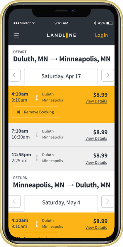
Landline was using a template website that did not have the functionality needed for a positive mobile experience. In an industry where the online interface is king, they needed an inviting platform that would take visitors through every step of the booking process. Beyond the online experience, Landline needed its guest experience to match by offering in-person consistency and ease.

Mapping out the ideal journey
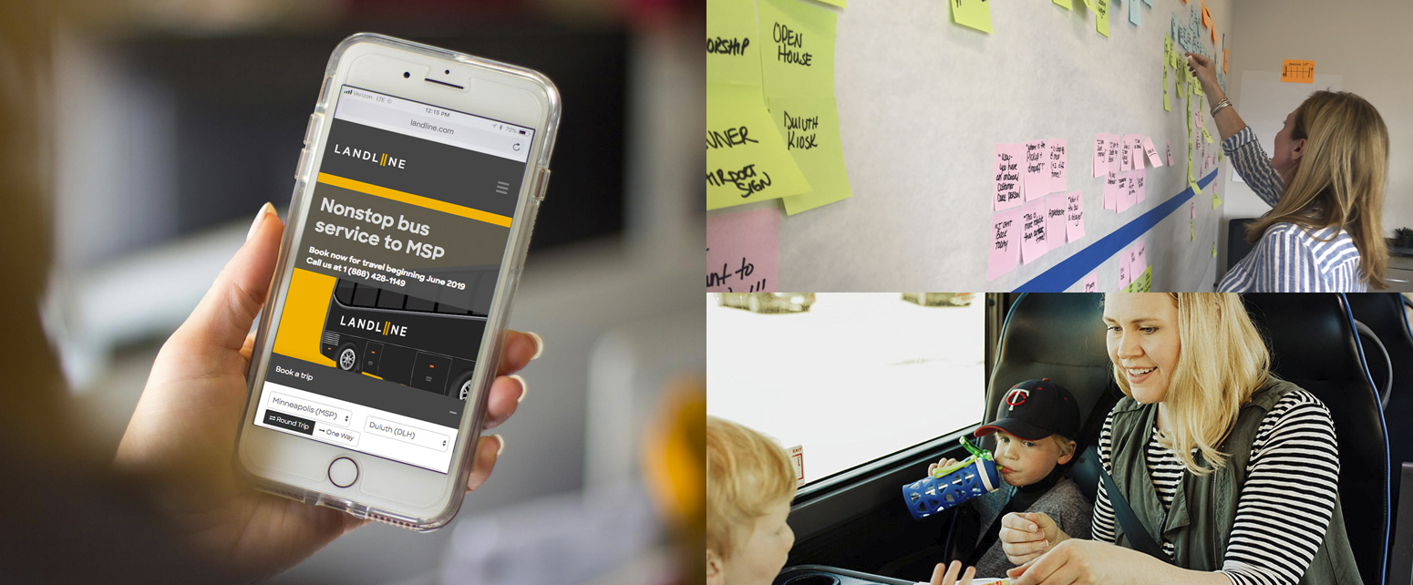
Following a successful launch of Landline’s branding, we took time to map out their customers’ ideal journey. We focused on three target personas such as a mother traveling with a family or a budget conscious traveler. Walking through every aspect from initial interest to post-trip reviews allowed us to uncover possible customer friction points.

Streamlined Solution
Half of Landline’s customers booked on mobile devices. We worked with their development team to architect and design an experience that would ensure an easy and efficient ticket purchase conversion. Outside of the booking experience, we worked to streamline website copy, design, functionality and accessibility.
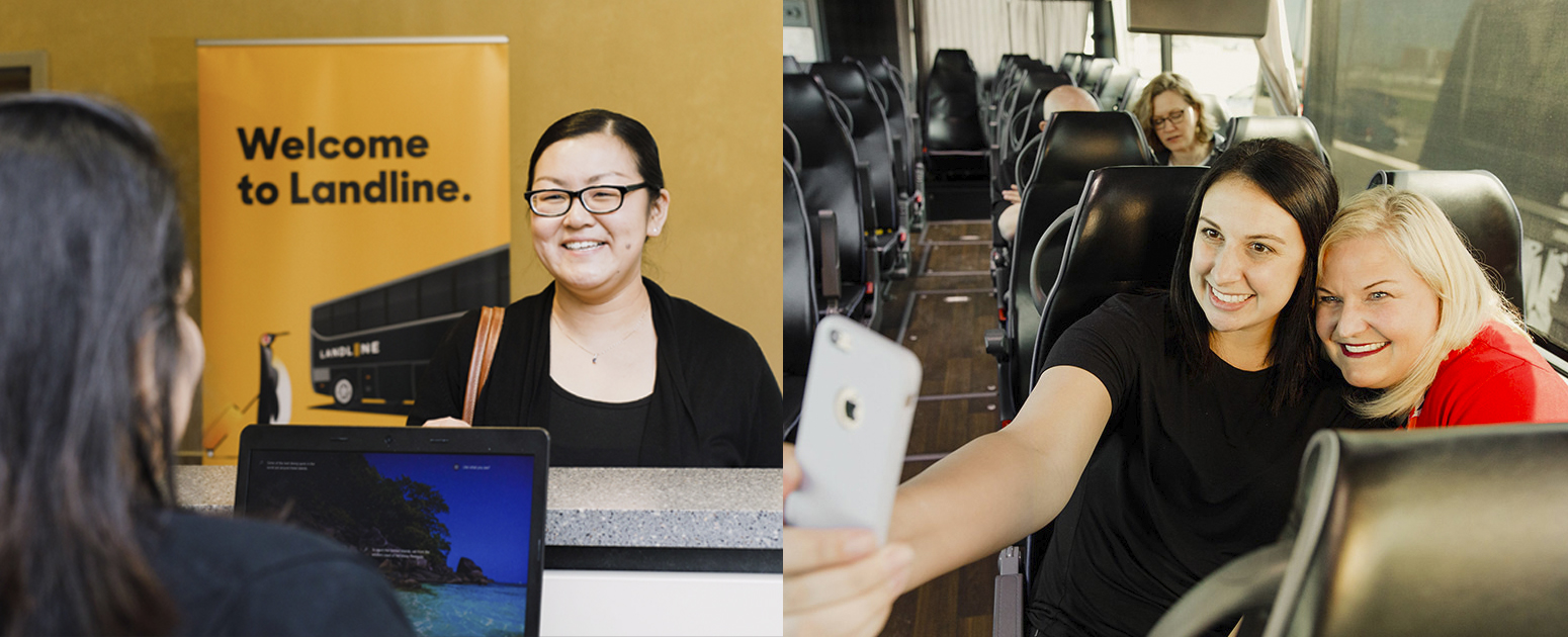
To improve the in-person experience, more way-finding signage was added at their airport locations as well as additional information regarding their check-in and loading process. We also developed a series of additional service options to add to the upscale onboard experience and differentiate Landline from the competition. For example, onboard coloring sheets for young travelers, coffee for early routes and seatback information about the Wi-Fi and other useful route information.

