A fresh new identity for a valued community resource
New name, new future
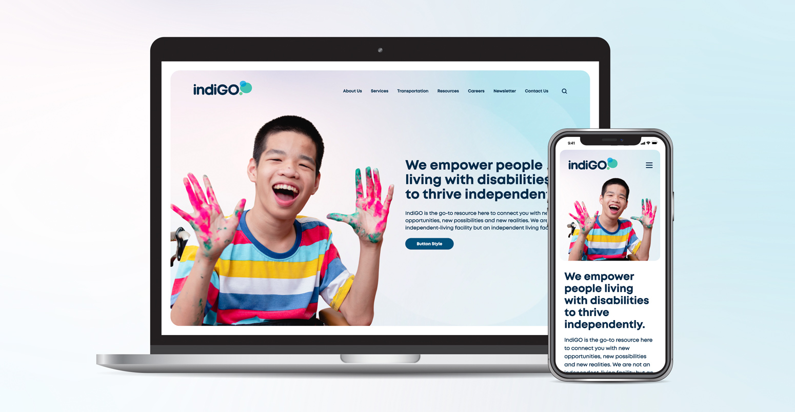
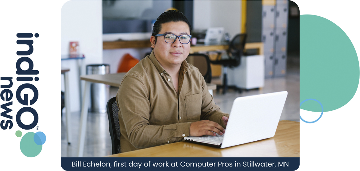
IndiGO empowers people living with disabilities to thrive independently. They are the go-to resource for connecting people with disabilities with new opportunities, new possibilities and new realities — not an independent-living facility but an independent-living facilitator.
Our client needed a new name for North Country Independent Living. Their name did not accurately represent their organization and caused confusion. It was geographically misleading as well. Their name needed to be inclusive, representative and easily understood.
We were excited to help give them an identity that sparks a feeling of power and energy.
Colors, shapes and feelings of support
We provided a new name, tagline and brand identity, trademarking services, business package and web templates. The name indiGO is based on “individuals who go.” GO is emphasized and becomes the metaphor for living life actively. The name and brand also embrace the color indigo. Its meaning is powerful and dignified; it conveys feelings of integrity, deep sincerity, service to humanity, great devotion, wisdom and justice along with fairness.
The logo features a nod to speech bubbles or a “green light” by the subtly located green shape at the end of “GO.” They overlay each other and change each other’s makeup. These bouncing bubbles add a splash of color and individuality to the logo.
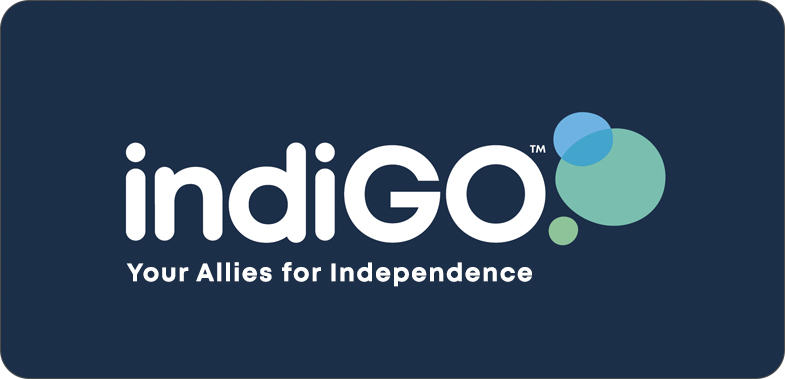
We came up with a tagline that says indiGO is here to provide support and connections to help people live independently. “Your allies for independence” seemed to connect all the dots.
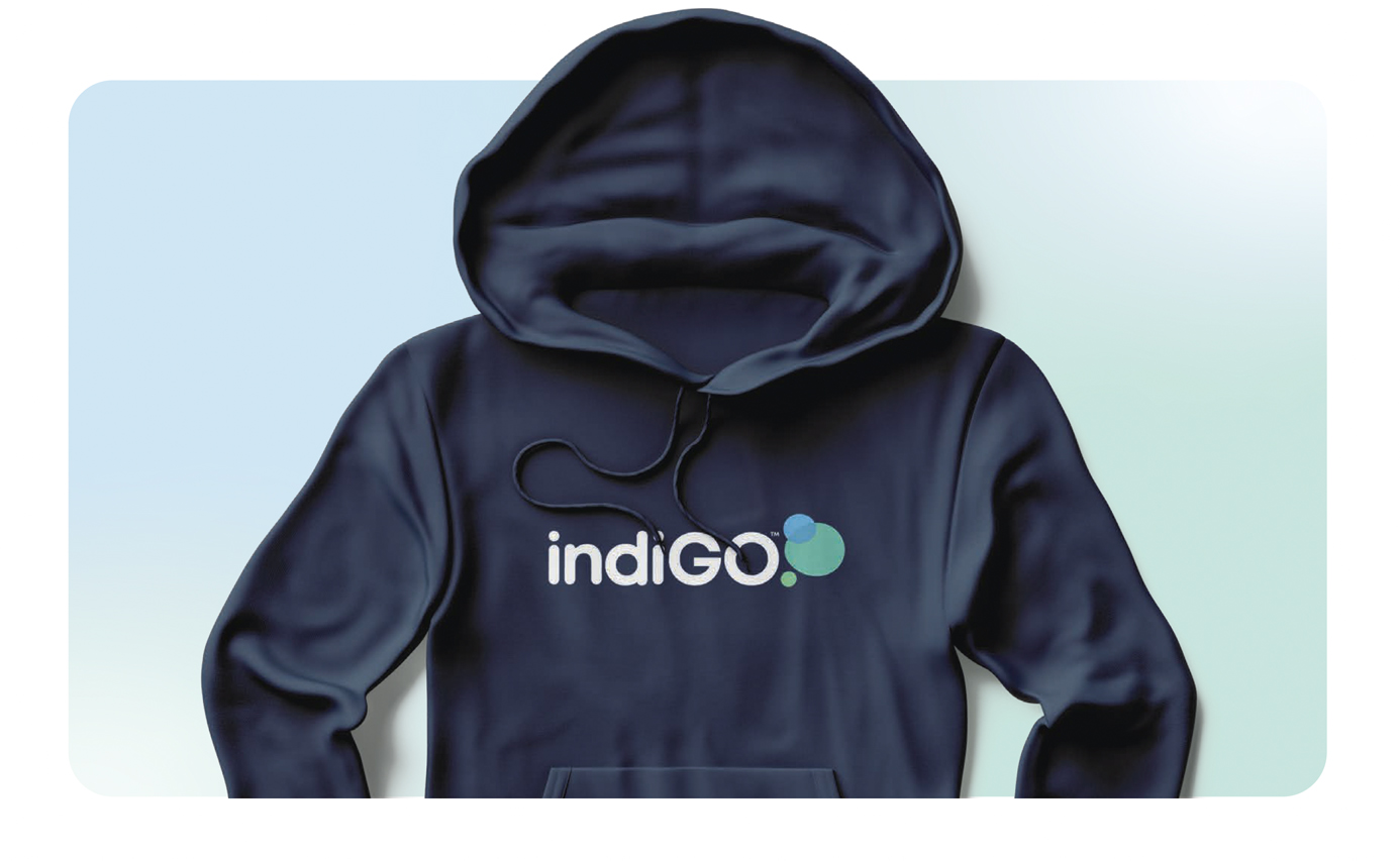
Put it on a sweatshirt
We created a memorable name their staff could not wait to wear. The brand palette has also inspired them to create a fun office space.
“I am just so pleased and impressed when I look at this. I cannot wait to roll out our very first indiGO news edition!”
– Jill Nyberg,
Executive Director