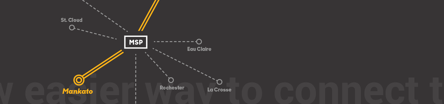
Redefining regional transportation with seamless, sustainable and affordable bus to air travel.
GIVING WINGS TO A UNIQUE NEW CONCEPT IN TRAVEL
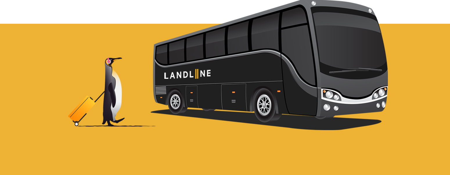
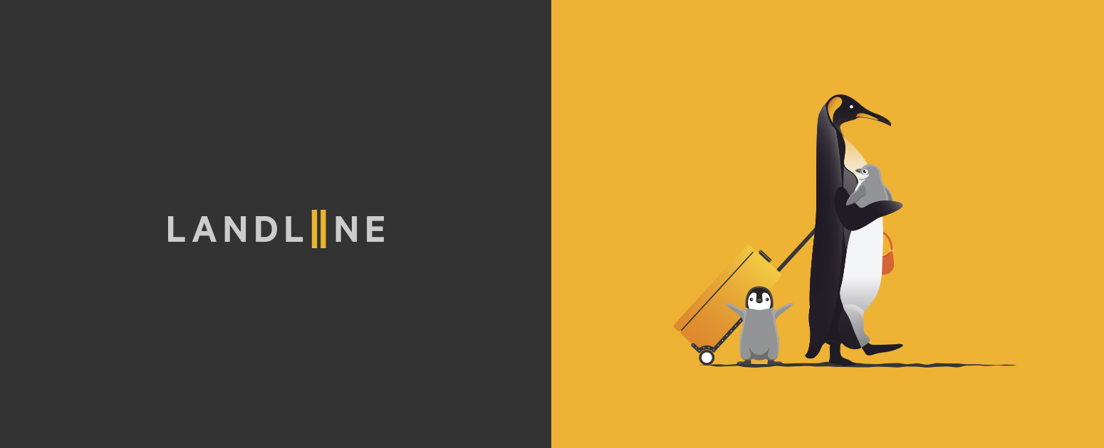
Landline lets people in more-remote communities access air travel. Penguins made the perfect mascot – flightless yet confident and stylish. Relying heavily on a unique illustration style allowed us to play up the fun, luxurious nature of the brand while positioning Landline’s colors at the forefront. Even without showing real people, the bus and the mascot feel inviting.
The brand tone for Landline needed to strike a balance. With a business model focused on simple service that takes the headaches out of travel, we needed messaging that felt helpful, clear and consistent yet also fresh and new. This isn’t your same-old airport shuttle, after all.


CREATING A LOOK THAT SAYS IT ALL
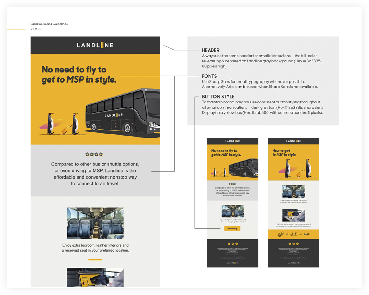
Landline came to us with a logo and two primary colors. We added two additional color palettes to enhance the visual appeal of promotional materials and improve online readability. Since the brand leaned on an illustrative style, we developed a suite of icons for use on tickets, promo items and materials. Photos were leveraged to add warmth and show the physical features of the bus or check-in/booking process. Finally, we laid out brand guidelines to ensure a consistent message across multiple hub stations, global partners, and a diverse array of media applications.


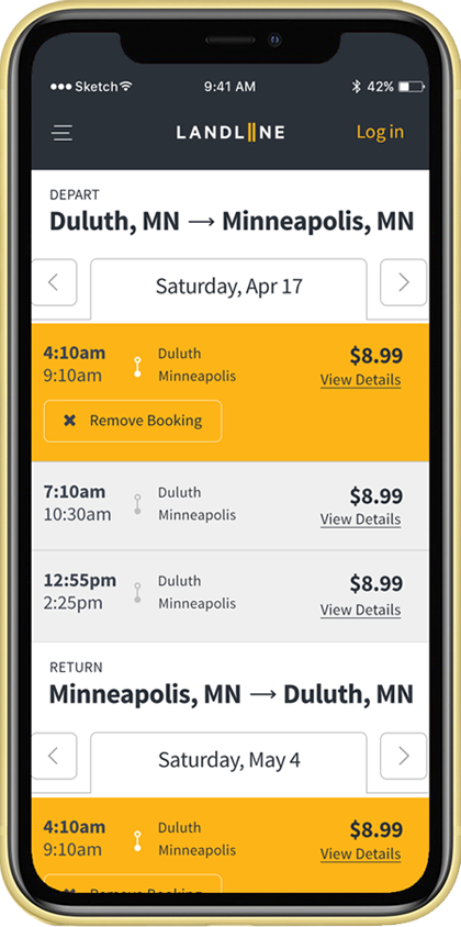
Improving the booking and traveling experience.
Following a successful launch of Landline’s branding, we took time to map out their customers’ ideal journey. Walking through every aspect of the customer experience allowed us to uncover possible customer friction points and make improvements.